InPACT at Home Project
Winner of Innovation and Entrepreneurship Award UMSI 2022 Annual Student Project Virtual Exposition
My Role: UX Designer
Responsibilities: User Research, Interaction Design, UI Design
Work Setting: Team of 3 other UX designers
Client: InPACT at Home
Project Timeline: September 2021 - April 2022 (8 months)
Tools: Figma
Overview
Why InPact At Home?
Out of all the client choices I had the opportunity to choose from for my senior capstone project, I decided to work with InPact at Home because I believed in their mission and positive impact on families in the midst of the ongoing pandemic.
Covid-19 had undoubtedly disrupted people’s health and fitness routines.
With schools and gyms closed for months, families had to figure out other ways to maintain an exercise routine.
Additionally, the disruption that Covid-19 took on everyone’s lives made the overall motivation to exercise extremely difficult.
At a time like this, families need help to maintain a health and fitness routine. This is where InPact at Home comes in!
InPact at Home’s mission is to help their audience maintain a health and fitness routine during the COVID-19 pandemic and beyond.
Problem
Although the InPACT at Home website was recently redesigned in the beginning of 2021, there are currently only 23 visitors.
The lack of users and retention on the website was evidence that the website needed to be studied and vastly improved. The main assumption for this outcome was that parents and children are not motivated to engage in the program’s various physical exercise opportunities.
Project Goal
My team aimed to create a better user experience through personalization to attract and retain more users. Our goal for having more users was to increase awareness of the InPact at Home program so there would be a higher impact on students’ health and Fitness.
To do this, we needed to increase users' motivation and engagement in home-based physical activities via gamification elements.
Process
Initial Research
Our first step was placing ourselves in the POV of users of this website.
By experiencing the website through the user's eyes we were able to easily identify the pain points in each step of the experience. We conducted a heuristic evaluation, competitive analysis, user journey map, and user personas to kick off our initial research.
Pain Points
Visualize User’s Journey
The main pain points we found included the following:
After completing an exercise video, the reflection survey that InPact at Home offers has a lack of visibility on the page. In order to see the survey, users are required to scroll down the page.
After completing the reflection survey, there is no option shown for the user to go back to the page they were on before completing the survey. They would have to close the tab and reopen the website.
Lack of workout progress tracking and overall personalization. Only indicators of progress include star badges and ranks that users can earn if they watch a certain amount of videos.
There’s an oversaturation of video choices for users to choose from which can cause users to become overwhelmed. It would be difficult for users to figure out which video to even start with.
User Interviews
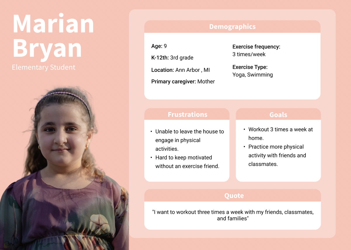
To get a better understanding of the user experience through the users' eyes we conducted several user interviews with parents of K-12th grade students. Although K-12th grade students and their parents both make up the target audience, most K-12th grade students are under the age of 18 so the parents were our main source for insight.
Research Questions:
What are the users’ (parents and K-12 students) experiences with physical activity and other online workout videos?
What are the pain points for the current InPACT at Home website and how would gamifying home-based physical activities motivate the users?
Demographic Main Findings:
Parents acknowledged that they did not exercise a lot themselves and emphasized that they wanted to change and increase exercise within the home for the benefit of not only themselves but their children.
Parents thought that their kids found it difficult to stay motivated without exercising with a peer, and they lacked a consistent workout schedule.
Website Main Findings:
Absence of the ‘undo’ function prevents users from going back to the previous screen after earning a badge.
When the action button is clicked or the process is completed, the system does not provide progress to users.
UX Requirements
What is needed for InPACT at Home to increase users' motivation to maintain their exercise routines? In order to answer this question, we reviewed our findings and put into words what is required to improve the current user experience.
Must Have
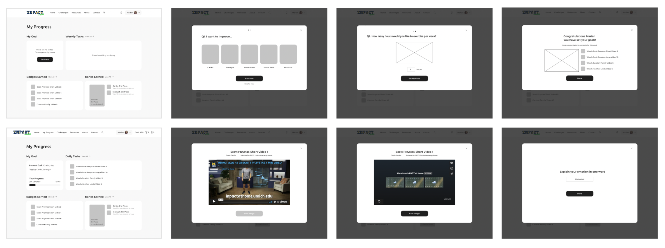
Personalize users' experience by allowing users to set their health and fitness goals.
Provide weekly tasks to reduce the decision time.
Motivate users by celebrating their accomplishments.
Increase navigation usability to ensure users achieve their tasks.
Should Have
Improve UX writing with clear and simple language.
Establish a clear information/visual hierarchy to help users digest information easily.
Nice to Have
Minimize high cognitive load by displaying users’ history.
Give feedback for current state, errors, and notifications.
Iterative Design & User Testing
In the design process, we focused on adhering to the UX requirements we identified from our research. Through multiple design iterations, we were able to properly translate design concepts and information structure to tangible representation.
Example of iterative design for ‘My Progress Page’
Sketches
Our initial sketches consisted of standard gamified features to show users their achievements and increase motivation:
Avatar to represent the user
Progress bar for the user to keep track of their fitness progress
Reward sections showing the badges and ranks earned for activity completion
Pop-up notifications to inform users when they’ve earned a badge
Low Fidelity Prototype
While mocking up the lo-fi prototype based on our sketches, we noticed that there was a feature we could add that would significantly improve the design: Personalized weekly goals.
Oftentimes users want to immediately set very high fitness goals that are too difficult to reach, resulting in lost motivation. Our personalized weekly goals were created to help users achieve realistic expectations through a personalized selection of fitness videos.
User Testing: Round 1
To make sure our design meets the needs and expectations of its target audience, we conducted our 1st round of user testing with 3 participants who were previously interviewed.
Main findings:
Setting a weekly goal can be challenging due to the variation in daily schedules.
Users are not entirely sure how many minutes are recommended for a K-12th student.
Users are confused where to begin on the progress page and how to navigate it effectively.
Medium Fidelity Prototype
Based on the first round of user testing, we refined our designs and implemented the design changes into a mid-fi prototype.
Main Solutions:
Switch to a minute-based goal-setting option instead of hours per week.
Added a feature that provides users with a suggestion on how many minutes per day might be appropriate.
Added a guided tour of the four segments to help let the user know what the purpose of each one is and how it will help them track their progress.
User Testing: Round 2
In order to identify possible additional areas of confusion and hidden opportunities, the team conducted another round of user testing with 3 participants. When we showed our participants our revised design in the second round, most expressed that they liked the changes we made after the first round. Our team felt like this showed that we are headed towards the right direction in terms of continuing to improve our design.
Main Finding:
Users were uncertain about the meaning of each topic and how many selections they need to make
Main Solutions:
Added a sentence to provide users with clear instructions on what to do on the specific screen.
Included descriptions for each topic, which users can access by hovering over the "i" icon located next to the title of each topic.
High Fidelity Prototype
From the last iteration of the medium-fidelity design to the high fidelity design, the team brainstormed together what design changes are most necessary and what visuals would make the website look most fun and aesthetically pleasing.
Since the main audience is K-12 students and their parents, we thought it would be important to use fun, bright colors and a variety of visual icons to draw their attention.
Feedback from Peers and Client
Before confirming which final design changes to move forward with, we presented our designs to our clients and peers and asked for feedback.
Main Finding:
The feature “Your Progress” was not visually prioritized enough. The attention immediately goes to “Personal Goal'“ and “Topics”.
Solution:
Restructured the information hierarchy to direct users to check their progress before focusing on their personal goals and selected topics.
Broke down the "My Goal" section into three distinct sections, "Overview", "Fitness Goal," and "Focused Topics."
Final Design Decisions
When presenting our final design decisions to the client, we reiterated that our main design enhancements were created to complete our main goal for this project, which was to increase users' motivation and engagement in home-based physical activities via gamification elements.
1. Track Workout Progress
My Progress page provides an overview of the user’s goal and their completion toward it, daily tasks, focused topics, activities, and badges and ranks earned. It increases engagement and motivation to work out consistently.
2. Learn
Interface through Guided Tour
New users will be guided through the features of the progress page that eliminate the confusion of navigating through the My Progress page.
3. Set Fitness Goal
The current InPACT at Home website has no feature for setting the user’s goals, where users have too many options to navigate that may increase in decision time.
A fitness goal feature will make the website more personalized and help guide users in making decisions, thus reducing overall decision time.
4. Earn Rewards with Smoother Navigation
On the current InPACT at Home website, the video reflection does not appear on the same screen after watching a video. Users must remember to scroll down and they also do not have an option to navigate back to the previous screen.
The design enhancement remind the users to earn a badge right after watching the video, reducing their time navigating the website.
Validating the Design
To validate our final design decisions, we conducted an evaluation study. Based on our evaluation study results, we can clearly see that our new design has an overall more user friendly design compared to the old design.
Task Completion Rate
This bar graph describes how many participants out of the 3 total participants could complete their task specific to the current and new design.
Unpaired T-Test: Number of Clicks for Task Completion
A statistically significant p-value (p-value less than the confidence level, 0.05) supports our new design enhancements by expressing significantly fewer clicks and time to complete a task.
Unpaired T-Test: Time (seconds) Task Completion
Based on the measurements, navigation through both the progress and account page is statistically significant and requires a less time to complete a task related to these pages.
Key Takeaways
A key barrier of a consistent workout regimen for K-12th grade students is lack of motivation.
User engagement with InPACT at Home will increase if users can track their physical activity progress in a daily manner and encounter positive reinforcements when completing a workout.
We achieved statistically significant results on tasks and metrics related to website navigation, validating our new design is quantitively more efficient than the current design.


